
Till the make-up week, we kept working on our coffee table book. Ma’am had given me certain suggestion to work upon. I have worked upon them and here i have attached the changes the improvised version.
Improvisations:
- Earlier i had chosen the font CASTELLAR, the problem with this font was that it was designed with keeping all the letters upper-case only and this affected the content readability. So i changed my font to Adobe Devnagari.
- Earlier all my content was center aligned so i changed it to left aligned to make it easy for the readers to read the content.
- Another mistake i made was that my content was not aligned to the columns so i made this change of aligning all of them.
- To make these tasks easier i used character style and paragraph style. Also so that i do not make any mistake for the font size or any other related arrangement.
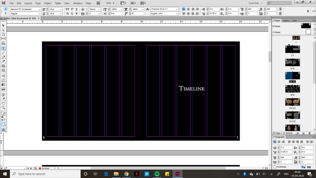
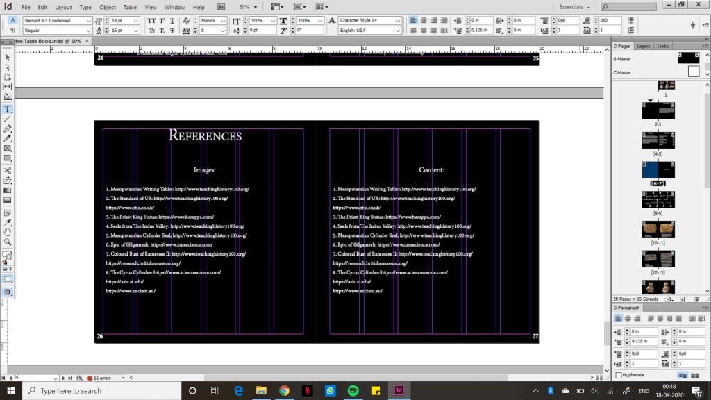
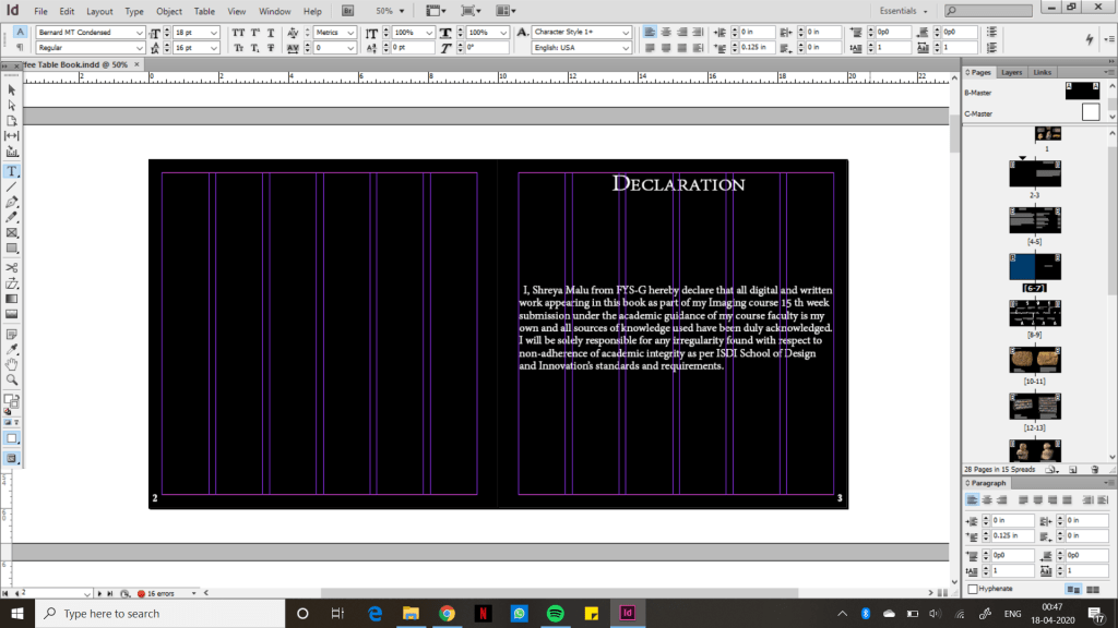
After finalising my Objects-content pages i moved on to the other pages. I begin with the cover page, moving on to the time line, then the preface and content pages, then the reference page, then the last page and at last the declaration page.
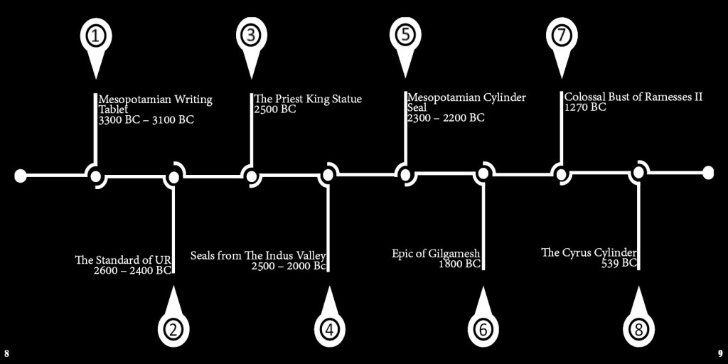
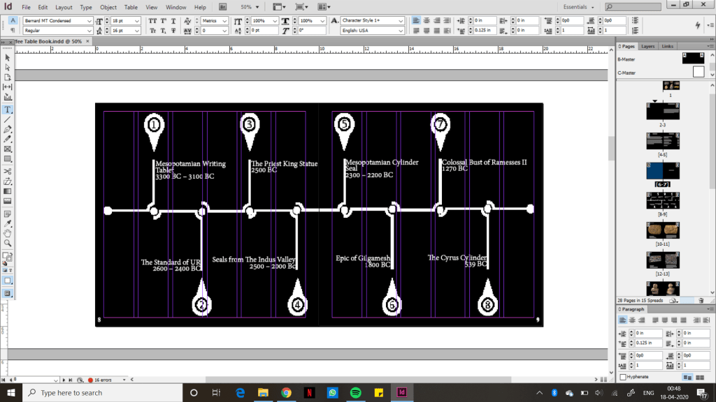
I faced a little problem while doing to timeline because there were too many parts all together and it wasn’t really becoming possible to align them to the columns. So, i asked ma’am and didn’t align them to the columns. I found it easier to work on Photoshop to make the timeline because in design is quite rigid comparatively.
Next i worked on was my side cover page. This one was quite easy and quick.

